
Choosing a color theme is one of the most impactful decisions you can make for your home. The right palette ties rooms together, sets mood, and makes decorating easier.
This guide breaks the process into practical steps: assess, choose a base, add accents, and refine with textiles and accessories so you get a cohesive look you’ll enjoy every day.
1. Start with the Big Picture: Purpose and Personality
Before picking swatches, clarify how you want each room to feel—calming, energizing, cozy, or formal. Your lifestyle and personal tastes should lead the palette: young families may prioritize durable, forgiving tones; entertaining-focused homes might opt for bolder contrasts. If you’re shopping for overall decor pieces, browse the Home Decor category to see cohesive groupings that can inspire a whole-room palette.
2. Assess Fixed Elements First
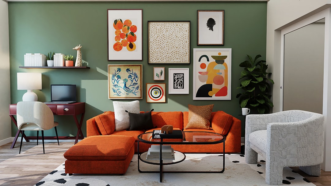
Work around immovable features: flooring, countertops, large built-ins, and permanent cabinetry. These elements usually dictate the base neutrals. When picking color for living areas, consider how large furniture anchors will read in the space—sofas and sectionals are often the largest visual blocks, so choose them with the base palette in mind. Look at the Sofas & Sectionals selection to understand scale and dominant tones when choosing a base color.
3. Choose a Base Palette: Neutrals or Tonal
A reliable approach is a three-tiered palette: base (walls, large furniture), secondary (rugs, curtains), and accent (decor, small furniture). Bases often work best as neutrals—warm beiges, cool greys, or creamy whites—because they provide flexibility. If you prefer more color overall, pick a tonal approach where different values (light to dark) of the same hue create harmony. Use wall and window treatments to amplify the base—check Wall & Window Decor for ideas that show how curtains and treatments transform a color scheme.
4. Add Accent Colors Strategically
Accent colors give personality and should be used sparingly in deliberate placements: one or two accent walls, a pair of chairs, throw pillows, or a rug. The trick is balance—repeat the accent in three places to make it feel intentional. Accent furniture like statement chairs are the easiest way to introduce a new color without overwhelming the room; explore Accent Chairs & Ottomans to see how a single piece can define an accent hue.
5. Use Textiles to Reinforce and Soften Color
Textiles—pillows, throws, curtains, and rugs—are your best friends for testing and refining color choices because they’re easy to change. Start with neutral upholstery and add patterned pillows or layered throws to experiment. A coordinated set of pillow covers can quickly show how colors interact. For a ready option, consider the EcoLily Decorative Throw Pillow Covers to trial color combinations before committing to larger investments.
6. Layer with Accessories and Art
Accessories refine a palette and communicate style. Metallics, glass, wood, and ceramics add contrast and texture. Start with a neutral base and bring in accent color through vases, trays, picture frames, and sculptural pieces. Small groupings of coordinated items create visual rhythm on bookshelves or coffee tables—browse the Vases & Accent Pieces section for examples of how accessory colors influence a scheme.
7. Bring in Living Elements and Texture
Plants and organic textures warm a palette and can soften strong colors. Greenery pairs with almost any color palette and helps spaces feel alive. If you prefer low-maintenance options, a realistic statement tree provides scale and a natural hue that unifies designs across rooms—consider an Artificial Olive Tree to add lush, consistent green without upkeep.
8. Mind the Small Details: Hardware and Everyday Items
Small items like coasters, trays, and tableware can echo or contrast your main colors and are an affordable way to experiment. Use a handful of accent-toned details to tie different rooms together subtly. For example, color-coordinated coasters on a coffee table repeat an accent in a functional way—see the Mckanti 8 Pcs Drink Coasters with Holder as a small, budget-friendly accent option.
9. Test, Adjust, and Live with It
Paint samples, temporary pillow covers, and rearranging accessories are low-risk ways to test a palette. Live with your choices for a few weeks—observe them in different light and daily use. It’s normal to refine: swap one accent color, change curtain tone, or add a rug to shift the balance. Practical testing will prevent costly mistakes and proves whether the scheme fits your life.
Checklist: Quick Color Theme Steps
- Define each room’s mood and purpose.
- Survey fixed elements (floors, cabinets) and match your base.
- Choose a 3-tier palette: base, secondary, accent.
- Introduce accent color in three repeat spots.
- Use textiles for easy, reversible color testing.
- Add accessories and plants to layer texture and color.
- Live with the palette and tweak based on daily light and use.
FAQ
Q: How many colors should I use in one room?
A: Aim for three main colors: a dominant base, a secondary color, and one accent. This keeps the scheme cohesive while allowing variety.
Q: What if my room gets different light at different times?
A: Observe paint swatches and textiles at morning, afternoon, and evening light before finalizing. Adjust saturation levels accordingly—brighter light tolerates deeper colors.
Q: Can I mix warm and cool tones?
A: Yes—do it intentionally. Use a dominant temperature (warm or cool) and add small elements of the opposite as accents to create interest without visual conflict.
Q: How do I make a small room feel larger with color?
A: Use lighter, low-contrast bases and extend the base color into trim and ceilings. Keep large furniture in neutral tones and use small pops of accent color.
Q: When should I commit to a bold wall color?
A: Test with samples and temporary textiles first. Commit when the color complements fixed elements and you find matching accessories easily.
Conclusion — Practical Takeaway
Start with purpose, build a three-tier palette, and test with textiles and small accessories before committing to large investments. Use repeat and balance—three placements for each accent—and refine through real-life use. Small, deliberate changes yield a cohesive, adaptable color theme you’ll enjoy long-term.
Products Featured in This Article

Mckanti 8 Pcs Drink Coasters with H…
🍷What You Get: You will get more quantity and more multiple styles coasters from us than…

Artificial Olive Tree – 6FT T…
✅ Natural Elegance: Our lifelike Cozy Flora 6FT Artificial Olive Tree, an indoor decor masterpiece, boasts…

EcoLily Decorative Throw Pillow Cov…
Make sure this fits by entering your model number. Fabric Type: Premium Soft 100% Cotton IT…